If you follow Deep Space Sparkle in any way, this may look familiar to you. Although Deep Space Sparkle is 100% responsible for this idea, I executed this project in a completely different way. I began this project by introducing them to a variety of sculpture terms in the form of a PowerPoint presentation.
After the PowerPoint, I had them draw 7 medium sized ovals, 1 small oval and a triangle on a sheet of drawing paper. Below is an example of what their paper looked like.
Be very observant while students are drawing! Make sure the ovals are not too small.
I have access to watercolor crayons at my school so that is how we added color to our shapes. You can use whatever medium you’d like! The only MUST have are the highlight(s) that should be on each shape (yes even the small oval and triangle)! Remind students that without the highlights, the balloon won’t look “shiny.” Once each shape has color, move onto the background.
The [initial] PowerPoint, shape drawing and coloring took one class period (50mins). Below is the PowerPoint I introduced at the beginning of the next class period. It is a review of the vocab terms. I only see my elementary kids once a week so this was a good refresher/assessment.
We completed the rest of the project in the following order:
Draw a cityscape (we used crayons but you can use whatever you’d like).
Draw a bush on green paper. Add details such as: eyes popping out, flowers, bugs, etc. Cut out and glue ON TOP of the cityscape.
Draw fire hydrant. Cut out and glue to side walk. You can do a live teacher demo on how to draw a fire hydrant, make a step by step handout or display an image of a hydrant on the board. The fire hydrant is an addition I made to the Deep Space Sparkle project. I wanted the hydrant to show the scale of the “sculpture” in comparison to the hydrant.
Along with all the sculpture vocab they were learning, I threw in the terms background, middle ground and foreground. We watched the following video and then examined our own project by labeling each section. (background = cityscape, middle ground = bush, foreground = sculpture/ hydrant)
I stopped the video at 1:51
Last but not least…cutting out each shape and assembling them correctly. See student examples below for structure reference. Drop shadows were added at the end for that extra touch of realism.
The following packet is meant to be used as an introduction or a review of the elements and principles of art. By no means would I ask my students to complete these 2 worksheets and call it “covered.”
Teacher Sample
Here are the following Elements and Principles review pages:
As a review at the end of the year, my HS Art 1 completed our Elements of Art in Sign Language project. They had to choose a 6 letter word (no acronyms) with each hand representing an element of art. They had to use line, shapes, form, value, space and texture. The last element, color, was off limits because they were required to color their hands anyways therefor all 7 elements were ultimately included. I did not require a certain order – they had free range! Below are student examples:
I have seen this project all over Pinterest and Instagram but I never found a handout for how to execute the project. So naturally a made a handout myself! Feel free to download/save the image and make copies for your own class!
I would start this project with a PowerPoint that introduces warm/cool colors (used for the sweaters) as well as different types of texture. You can choose to jump right into the drawing if you’d like!
TIP: I suggest having your students practice first on paper that isn’t going to be used for the final project. I have loads of construction paper that was donated from fellow teachers at the beginning of the year so I have them practice on that. Most elementary teachers tend to skip practicing and just start ASAP due to the limited amount of times they see their students a week. I rather have my students “waste” crappy paper practicing than waste/ruin expensive drawing paper.
After the intro, I would demo how to draw the basic shapes of the bear’s facial structure. Next, I would explain how to draw the guide lines and explain their purpose. Once I feel they have successful grasped the concept I would walk around and help strugglin’ students. Everything else is self explanatory!
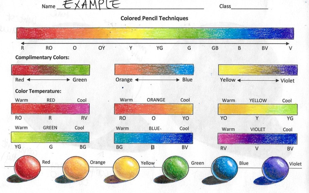
There are SO many different approaches for teaching colored pencils! I know I am not the first to come up with a handout but I’m here to share my resources with the internet! Feel free to share or print the following handouts.
I demoed how to shade a larger sphere on the back before allowing them to shade the smaller spheres on the front. Once they know how to shade one, they can shade them all using different color families.
Here is the colored pencil handout. Each piece of paper has 2 shading sections, meaning, these are intended to be half sheets.
The following handout has good tips and tricks for students (and adults who are Prismacolor beginners). The top portion has good advice and even some product recommendations.
Be sure to go over each bullet point with your students. I even took the initiative to bold and underline key vocab terms.
The bottom portion has the color families listed with exact Prismacolor names. For example, if you are shading a violet sphere, “Parma Violet, Violet, Violet Blue” would be the go to colors for that particular color family.
The colors are arranged from highlight/lightest to darkest (top to bottom). The shadows can be substituted for complimentary colors Or instead of tuscan red, you can use crimson red.
I added a completed color version of the color pencil technique handout on the backside of this handout. I highly recommend printing this handout in color. However, if you don’t have access to a colored printer, be sure to only print the tips/tricks side.
I currently work at an elementary school but my district is super strict about the amount of wall space I can cover as well as the exclusion of any fabric. Although it may not seem as colorful as a typical elementary art room, I love the outcome!
BEFOREAFTERAFTER
Here is my teaching throne aka a basic wooden stool I bought at a thrift store and painted. It was actually really easy to find a used wooden stool BUT if you are having a tough time finding a used one I suggest downloading the free app OfferUp. I went to Walmart and found new wooden stools but I was not going to pay $25-$30 for a wooden stool.
I painted the top with an art palette but you can paint anything you want! Some suggestions are: An apple with your name, the color wheel, your school’s mascot, a donut, crayon box, rainbow or just a solid color!
I loved the idea of doing pencils and crayons as the legs! I saw an example on Pinterest that had a glue stick as one of the legs which is a neat idea if you want each leg to be different. You could do a marker or a ruler as well!
I wanted a cute Bitmoji drawing placed right outside my door so HERE IT IS! If you like this idea but don’t have the time to make one, just print one! Go to the Bitmoji app > Select which image you like > Send image from phone to email> Upload it to Word> Print image! I didn’t have time to laminate mine but I would highly recommend laminating yours!
One thing I personally strive for is to have the least amount of “shadows.” What are these shadows you speak of? Well shadows are what I call kids who follow me around the room to ask a question. I created this drawer to house dead supplies. So instead of following me around the room to tell me their marker is dead, they will know to place it in the drawer and grab a new one. No biggie. I also plan on collecting dead markers from every teacher in the building and sending those dead markers back to Crayola. (Check out Crayola’s recycle program via their website).
This is a simple noise level trick I snagged from Pinterest. I made art palettes that spell out “ART” and on the back it has a warning #. If they lose all the letters in one class period, they will remain on a level zero for the remainder of class.
TIPS AND TRICKS IF THEY SURPASS THE SYSTEM: If your class continues to talk on level 0, you can make everyone put their head down and be silent for 5mins (or til the remainder of class if you like). If THAT still does not seem to work then you can make them write an apology letter for being rude/disruptive. I have used both the head down and apology letter and they work because kids do not want to lose art time. If it only seems to be a few disruptive students and not an entire class then I suggest pulling them to the side and having just them write a letter. (This is also a sneaky way to help build up their writing skills). If this tactic seems aggressive or a bit much? Then find an alternate way to control the noise level in your classroom.
*I know some teachers may not like the idea of associating writing as a negative experience but it is a personal choice whether or not you choose to use an apology letter*
Safe Space
I created this safe space for kids who are having a rough day. They may be having troubles at home, with their project or just frustrated with a classmate. I also have coloring sheets and some crayons in the drawer next to the chair. I also provided sensory jars (see earlier post for more info about how to create a sensory jar). I want to emphasis that this is NOT a timeout area/behavior issue student zone. I have an extra special desk specifically for those students.
Art Jobs
One way to manage your classroom is to assign each table a job. I change mine at the end of every 4 day rotation but you can change it everyday if you’d like! I stapled a file folder with extra jobs inside because, depending on the project, I may need specific jobs. Other jobs involve specific clean up procedures for clay, painting, printmaking, etc. For example, cleaning brayers is not something that will always be needed but is a necessary job during printmaking projects. Some other jobs you could have that are not shown above are: time keepers, pencil sharpeners, noise patrol and chair checkers. If you use other jobs that are not shown or listed PLEASE share your wisdom with me!
My bins stay on their tables to reduce the amount of unnecessary movement. My bins consist of: pencils, erasers, expo markers, scissors, glue (not pictured), a box of markers and a box of crayons. Depending on how well behaved your kinder kids are, you may want to remove scissors and expo markers from their bins everyday. They WILL cut things that are not paper and they WILL think the expo marker is a regular marker.
Bins are from Target and the boxes that contain markers/crayons are from Michaels.
Elements and Principles Posters
I bought the PDF versions of these wonderful E & P posters from Etsy. If you are interested in purchasing THESE posters, check out AlwaysSunnyCo.
Sink Setup
I have 3 sinks and each are color coded according to the ice cream cone cup (which holds paint brushes. I picked them up at my local Dollar Tree). I also have rags and drying mats because water gets everywhere so might as well catch as much as I can (also from Dollar Tree). I even created a mini sign that has my instructions for how to properly clean paint brushes.
*PAINT BRUSH WASHING VIDEO DEMO IS SOON TO COME. STAY TUNED*
I labeled each drawer according to where each colored paper is. This helps me QUICKLY find the color I need versus having to read a written label or open every drawer.
Supply Store
This whole side of my room consists of my supply store. Everything each class needs for the day is located in the cubbies. I even provide extra markers and crayons on either side of my shelf (all color coded to save time).
Sensory bottles can be used for a variety reasons and works well with a variety of ages! Some examples for how to use these in the classroom: introducing color theory (color mixing), sped students calm down jars, ADHD/ADD students, etc. THE POSSIBILITIES ARE ENDLESS!!
Great for art teachers!
Click the link below to learn how to create these amazing color mixing sensory bottles
I dyed my rice to add more of a POP! You can dye rice by adding a little bit of food coloring and vinegar. Make sure to let it dry before sealing it in a bottle
Click the link below to learn how to create these addictive i-spy bottles
My gallery set up of my drawing 2 and 3 students’ final fabric drawings
Over the course of 7 days, my advanced drawing classes practiced drawing different fabrics. Yes I made them practice that long before letting them start haha. Before we started drawing, I showed them the following demo video:
Very informative video! Highly recommend show this before they start drawing
After the video, they began drawing on a small sheet of paper (regular copy paper cut in half). They were asked to crop the image/fabric however they liked. I provided shirts of mine for them to reference from during the practice portion. Below are student examples from their first attempt at drawing fabric. I allowed them to use either pen or pencil. Since this was their first time drawing fabric I wanted them to use whatever they felt comfortable with.
Fabric – Day One Practice. After going over the assignment and watching the video, students drew the fabric pieces above in roughly 18 minutes
After about 3 days of working on the still life fabric on a small scale, I provided them with the following worksheet. It allows them to truly focus on the creases and work on values within the fabric. They were given 2 days to complete as much as they could with graphite pencils only – no pen.
Once the 2 days spent on the worksheet were completed, we moved onto a small scale version of their soon to be final drawing. I provided shirts, 9″ x 12″ toned paper, charcoal pencils and soft pastels (black and white). By this point, they were really getting the hang of drawing fabric and were ready to move onto charcoal. Below are some student examples from the miniature charcoal fabric drawings. I gave them 3 days to complete as much as they could. I never pressured them to completely finish a practice drawing because I just wanted them to get used to drawing technically. I knew that if I asked them to complete a practice drawing, they would rush.
They had 8 days to completely finish their fabric drawings on 18″ x 24″ toned paper. Below I provided the guidelines on to how to properly use the charcoal and soft pastels (I went into depth on each image and why it was approved or denied)
Here are the guidelines on how to use the materials
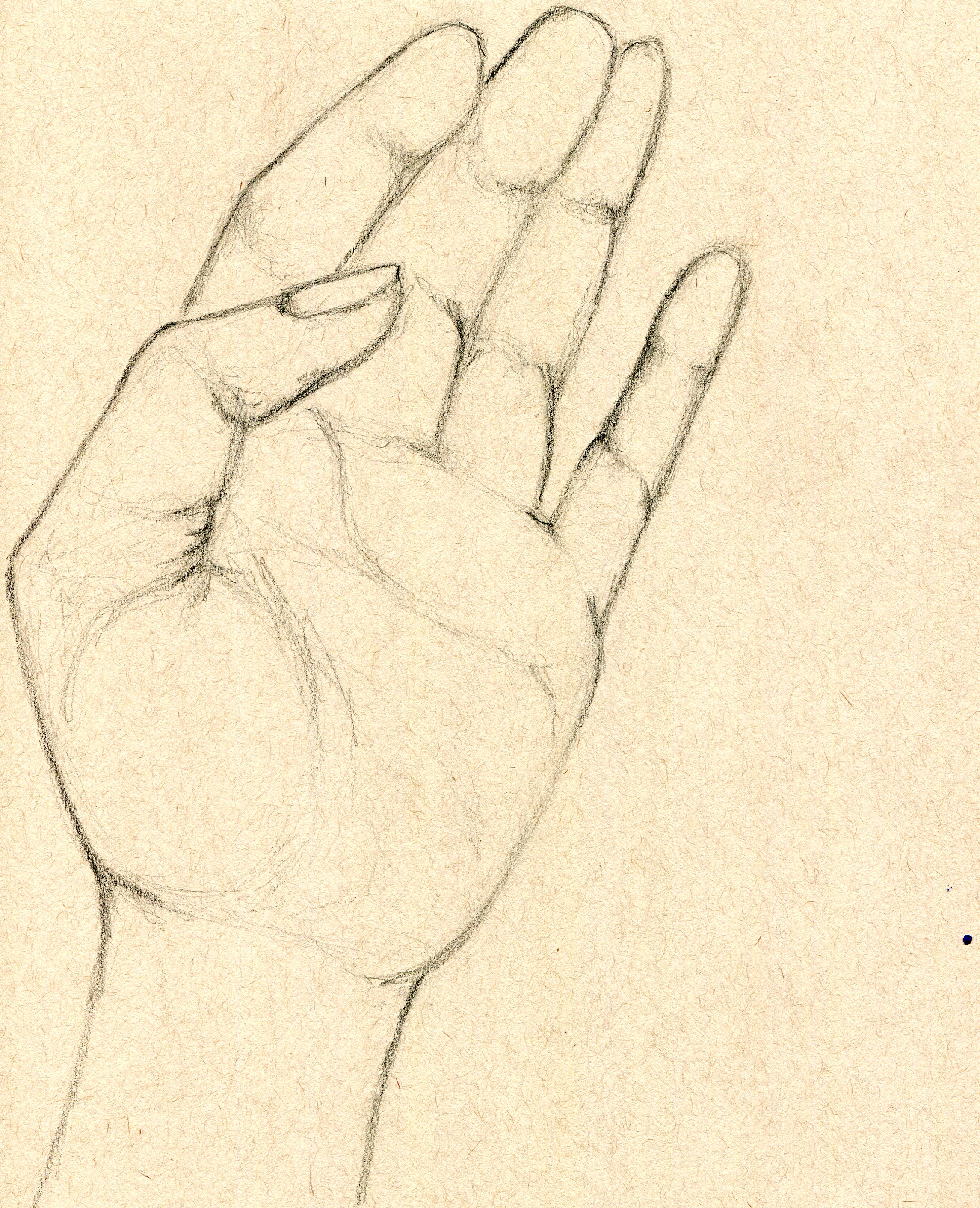
My example of 60 second hand gestures. I also had a 30 second hand gesture example
I start by asking my students to draw 30-60 second hand gestures. Its a great and easy way to start looking at the hand in its simplest form. I use an AMAZING website I think every teacher should use! Link is below
Below are student examples of 60 second hand gestures. We drew 10 hands – 10 hands drawn in 60 seconds and 15 hands drawn in 30 seconds. I didn’t want to waste a bunch of paper so I wrapped the table tops in butcher paper and they drew directly on top of the table. This allowed them to draw as big as they wanted. I also didn’t want them to waste time trying to figure out how to squeeze all their gestures on their paper – that would cut into their gesture drawing time! They also enjoyed drawing the tables (:
The following class day, they participated in blind contour drawings. We used mini hand statues for reference but you could always ask them to reference their own hand. For blind contour drawings, they place a piece of paper (and a board) in their lap under the table so they could not see what they were drawing. I gave them 60 seconds to complete each blind contour sketch. This activity really helps them focus on just the outline of the hands and not the little details.
Below are student examples of their blind contour drawings
The look on their face when they were allowed to finally look at their drawings…priceless
Once I felt that my students were comprehending the basic forms of the hand, we moved onto practicing an actual detailed sketch with graphite pencils. The reference images I used were from the gesture drawing website (I just copied the images I liked, pasted them onto a word document and printed one for each student). They had several days to complete the drawing. Below is a student example:
After the students had completed their sketches, I asked them to draw the following hand image in charcoal and soft black/white pastel. We discussed how to use the materials and how to distinguish a shadow from a highlight (basically making sure it doesn’t fall flat or get to messy).
Below is my teacher example (before and after charcoal) as well as the image I showed my students in regards to how to block out shadows & highlights
Below are student examples:
After their charcoal hand practice, I presented the following PowerPoint:
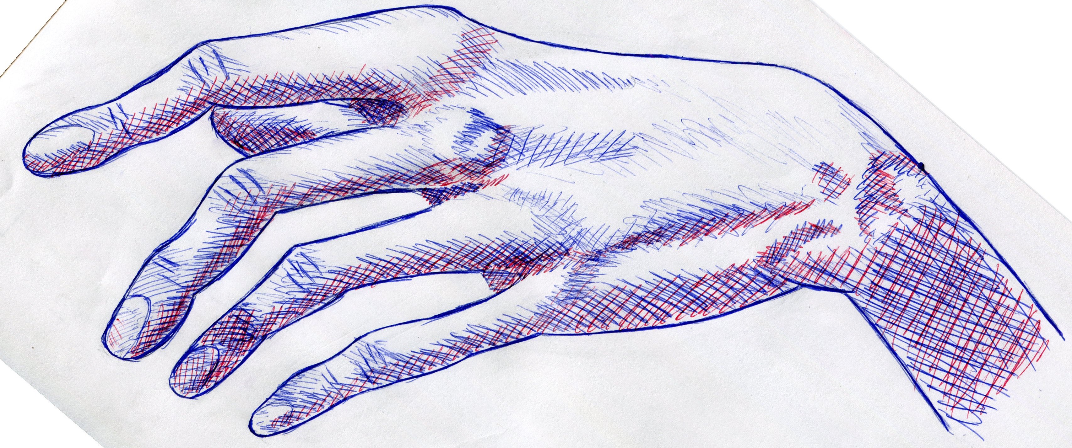
After we had gone over hatching/cross hatching/stippling, we jumped into hand and feet anatomy. See my lesson Hand Study for more info about how I begin any anatomy unit. Once the gestures of hands and feet were covered I led them into a practice activity.
I asked all my students to use the same reference image to start off with (it makes life easier I promise). Before they were allowed to move onto shading with graphite they had to check their proportions with me. Once they gotten cleared they began shading the hand NORMALLY – NOT WITH CROSS HATCHING/HATCHING LINES. The reason I ask them to shade with graphite first is to figure out where all the values are. After all graphite work was complete they started adding their lines in ink on top and erasing the graphite underneath. The following is a downloadable version of the reference image I used
The follow are students’ completed cross hatching/hatching practice hand:
My scanner awkwardly crops things but anyways – I love how this ended up looking with the blue and red lines. Almost 3D movie like!
I’m not at all ashamed to admit when a lesson (or part of a lesson) totally flopped! The two images above are the only successful hands that came out of that activity. I ended up doing a step by step demo with my kids before letting them move on to the final project. That live demo SAVED the outcome of this assignment.
For the major project I provided reference images to use or they could find/take their own image. The following are final products:


